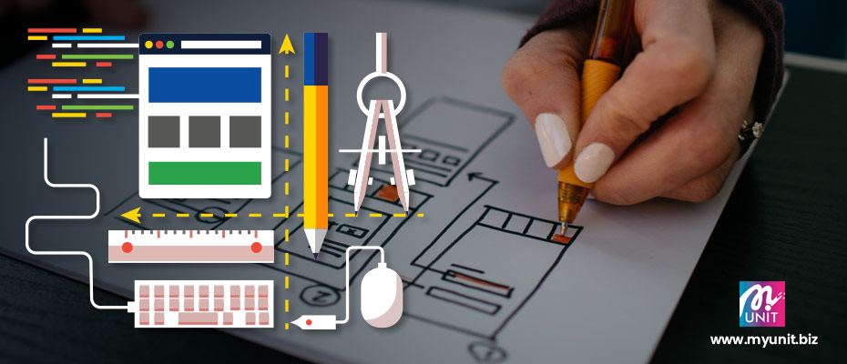
What’s make a pretty cool website you may ask? Well if you read on and follow through your site might look pretty very cool soon.
We’ve been in the design industry for as long as 20 years. During that time, we have came across many clients that say that their website is not nice, not engaging or even not up to par with their competitors website. Well design is a very, very subjective discipline.
You may say that this design is nice but your superior or management may not think that way. Even more, they might not like it at all. Some of our projects previously was delayed tremendously because of the design aspect.
It’s time to give your website a fresh new look.
We as human have a long term visual memory that has a massive storage capacity for object details, pretty cool isn’t it? We like to look at nice, beautiful and pretty things. Therefore with translation to that, your website will only have 3-5 seconds to capture the audience attention.
Design and conceptualization is a process that needs time to craft and deep thinking through it to match the visual and content. The emotion connection has to be there. It’s not a COPY & PASTE job.
As we have noted above, here are few pointers to take note of when designing your website.
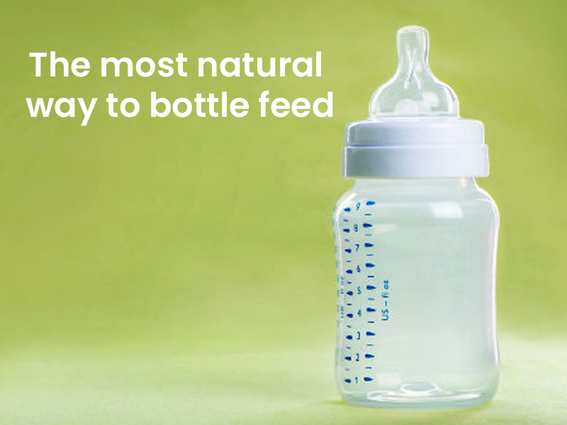
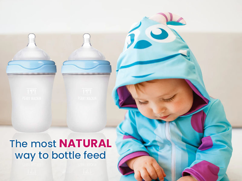
1. Use photo or images with human element in it.
As human, we tend to connect more to images that looks ALIVE. For this reason, you can see why major brands use ambassadors. They need the human element to be in there so it gives more confidence, warmth and a humane touch to it.
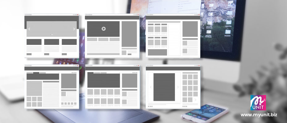
This is a visual statement that words cannot express it all. So let’s dive into the two images below for comparison. Let’s see which image captures your attention more.
2. Combine vector with images.
One way to give a fun twist to serious photos is by using vector elements. This fun trend in the design world is to combine illustrations with photographs, a technique that produces a unique look and lets you get as creative as you possibly can.
There will be a time that you’ll get a brief that needed a more abstract approach to the home banner design. You may use this mix & match style to create a one if its kind visual. Let’s take a look below for comparison purpose.
2. Combine vector with images.
To get a pretty cool website, one way is to give a fun twist to serious photos is by using vector elements. This fun trend in the design world is to combine illustrations with photographs, a technique that produces a unique look and lets you get as creative as you possibly can.
There will be a time that you’ll get a brief that needed a more abstract approach to the home banner design. You may use this mix & match style to create a one if its kind visual. Let’s take a look below for comparison purpose.
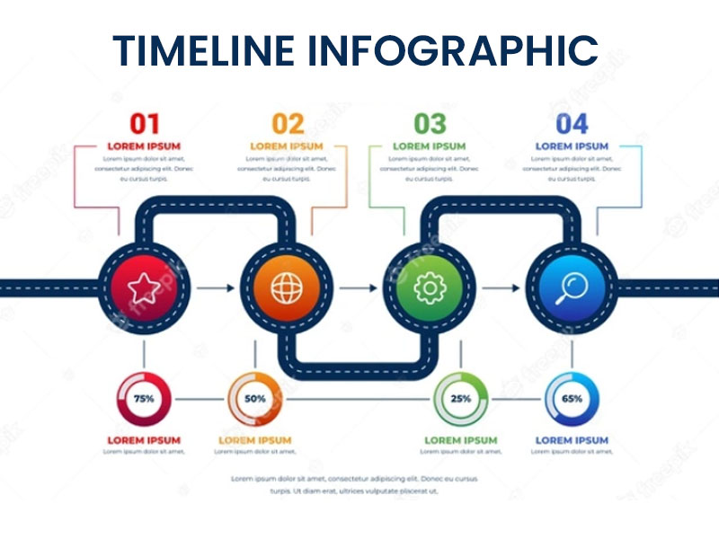
3. Use infographics to explain processes.
65.5% of people are visual learners. It’s important to cater to this large potential audience. Who wants to invest a great deal of energy reading, attempting to understand pages of difficult and confusing facts and numbers?
As a matter of fact, a great deal of what we share online today is visually image related. There’s simply such a lot of data around us that we can’t in any way remember everything in a restricted amount of time.
Nonetheless, there is no question, utilizing infographics to pass on figures and information will help viewers to digest those information in a significantly more productive manner.
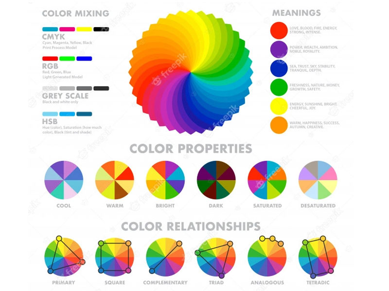
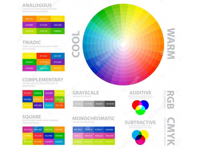
4. Understand the basic color chart.
To get a pretty cool website, learning about colors will help to freshen it up. I still remember my 12 Steadler color pencils back then during my art class. Am very jealous of my friends that were using 36 or 48 sticks. According to our art teacher in reality those 12 sticks can make you many more colors if you understand them properly.
In general colors are organized on a color wheel and grouped into 3 categories, namely primary, secondary and tertiary colors. The wheel consists of three primary colors which is red, yellow and blue. This are the father and mother of all other colors.
Next is the three secondary colors that are created when primary colors are mixed: green, orange, purple. Lastly there’s the six tertiary colors that are made from primary and secondary colors: Red-Orange, Yellow-Orange, Yellow-Green, Blue-Green, Blue-Violet and Red-Violet.
In short majority of people decide whether or not they like a certain product in 60 seconds or less. In sum, 90% of that decision is based solely on color. Therefore, take note that a very important part of your branding best to focus on color.
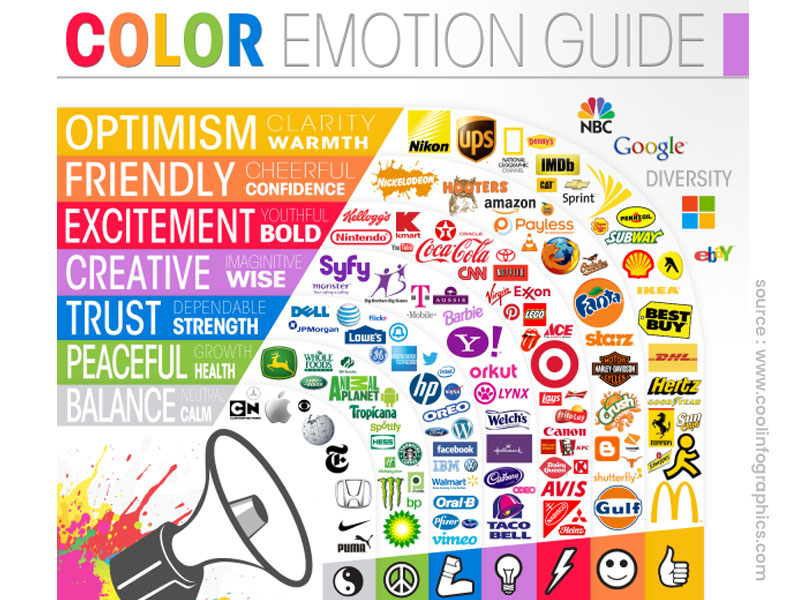
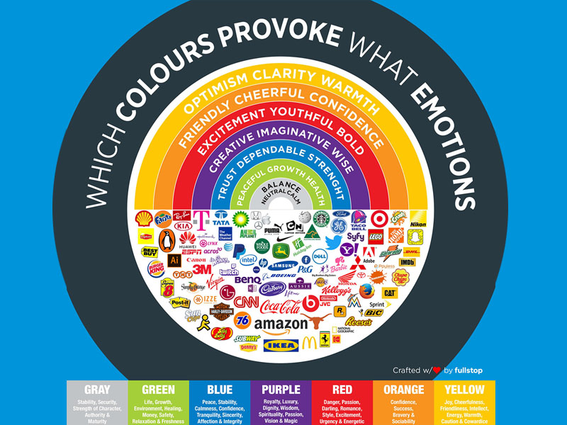
5. Use colors to invoke emotions.
We see colors everyday in our daily life. But have you thought of stopping for a while to think on how those colors are impacting you?
Whether it’s the calming effect of the blue ocean or skies, the spiciness of the red curry chicken, whereby each of those color taps into your emotion.
As a matter of fact there is an entire science in the meanings of colors. As a product or brand owner or designer, it’s important to be aware of these color meanings to help you choose your colors wisely and tap into the magical power of color symbolism.
Another key point to a pretty cool website is that colors can be a powerful tool if you know how to use them correctly. Eg. For businesses, whether it’s yours or your client’s there are many areas that color can come into play. Hence, you might immediately think of branding elements like the logo, business cards and stationery.
Finally, color choices will be meaningful across online communication and marketing materials such as your website, social media accounts, presentations as well as offline tools like flyers, poster and banner.
Quote of the day : "Just train your MIND and your BODY will follow."